
 Download PDF (348KB)
Mobile is Growing Faster than Ever
The advancement and distribution of an increasingly powerful telecommunications network has brought about an age of unsurpassed mobile growth. With over 4 billion mobile phone users globally as of 2012 and 66% of those users accessing the internet through mobile devices at least once a day, the rapidly increasing interest from tech innovators in mobile capabilities comes as no surprise.i
Driven by improved software, hardware, and the changing habits of mobile users, the opportunities for training and education via mobile devices has increased significantly, demanding the attention of eLearning experts. The continuous proliferation of personal smartphones and tablets with advanced web browsers has created an incredible environment for growth. Like all industries tethered to the rapidly evolving nature of technological innovation, the eLearning community must, and indeed does, embrace mobile learning, or ‘mLearning’.
In this guide, we present the following:
- Exploration of the conceptual meaning of mLearning
- Analysis of the definition through device, context and elements of design
- Support and discussion of mLearning capabilities
- Discussion of the technical qualities of development and design
- How eLearning and mLearning are mutually beneficial
eLearning vs. mLearning
The term ‘mLearning’ has traditionally been defined under the pretext of a device’s perceived physical capabilities. That is, mLearning has been equated with any eLearning module that can run on a portable device.
Author of Defining Mobile Learning, John Traxler, suggests that this definition is left wanting. “Such definitions and descriptions of mobile learning are perhaps rather techno-centric, not very stable and based around a set of hardware devices.”iiTraxler argues that this method of defining draws attention to mobile learning’s technical limitations rather than promoting its unique pedagogic advantages and characteristics.iii
In essence, this general definition barely scrapes the surface of mLearning’s actual meaning; implying mobile learning is a mere function of portability within an eLearning spectrum. To create truly engaging and effective mLearning, designers and developers alike must explore mLearning’s possibilities in its entirety. This requires moving beyond the superficial definition and examining mLearning’s attachment to device capabilities in conjunction with learner context and design elements, all of which are essential factors in defining mobile education and its distinction from eLearning.
Device and Technology
Defining mLearning purely in terms of its technologies and its hardware, namely that it is learning delivered or supported solely by handheld and mobile technologies, would be an incomplete definition. It is, however, an important cog in the mobile learning machine. This device driven definition of mLearning can be taken one step further through the concept of usage affordance, i.e. how one physically uses the device, rather than relying entirely on a predetermined list of “portable” devices. iv This notion suggests it is only logical to assume that mobile learning should be realistically mobile; likewise implying that true mobile learning is delivered through a device that is “naturally” accessible on the go, with a set of simple physical usage standards. That is, the device is not really a mobile device unless you can use it with two hands, standing up or in motion.v
With the variation among mobile devices, from size to operating system, an understanding of mobile education in terms of its technologies and hardware is essential for development purposes, however, these definitions are limiting and are highly subjective to the learner’s idea of mobility. Is content delivered on a laptop really mobile learning? The answer is not always so black and white.
For example, many learning departments have focused on tablets as a sort of middle ground for formal instruction in a structured travel setting, while smartphones act as medium to encourage best practice in informal learning in a truly mobile environment. It may in fact transpire that different hardware and software platforms support rather different interpretations of mobile learning. It is precisely because of this reason that defining mLearning cannot simply stop at the type of device. It is therefore necessary to examine other influencing factors outlining learner experiences and understanding how mobile learning differs from other forms of education, especially other forms of eLearning.vi
Technology in Context
If we take a look back at Traxler’s conceptualization of mLearning, he outlines a number of user associations including such words as ‘personal,’ ‘spontaneous,’ ‘opportunistic,’ ‘informal,’ ‘pervasive,’ ‘situated,’ ‘private,’ ‘context-aware,’ ‘bite-sized,’ and ‘portable.’ This is contrasted with words from the literature of conventional e-Learning such as ‘structured,’ ‘media-rich,’ ‘broadband,’ ‘interactive,’ ‘intelligent,’ and ‘usable.’ These two lists are highly indicative of the learner’s inherent expectations of a mobile learning experience, and as such, allow us to make a blurred distinction between mobile learning and e-Learning.vii
mLearning facilitates learning ‘on the move’ and so it is not static or tied to a place; it is learning within context. This may include learning while traveling, driving, sitting, or walking; it may be hands-free learning or eyes-free learning. These interpretations impact on the implementation and hence the definition of mobile learning. By focusing on the context how mLearning is being used, designers and developers can identify the advantages that mobile learning can provide for learners rather than on the limitations of the technology. It allows educators to capitalize on learner engagement inherent in mobile technology to provide learners with the best and most convenient learning tools possible.viii
Understanding how to utilize the advantages of mobile technology within a given context is the key to developing highly effective mLearning. Many experts are pointing to mLearning as a platform to find information and collaborate rather than necessarily possess it.ix This is supported by both the functionality and user expectations of mobile devices.
Design Elements
Heavily influenced by the previously discussed auspices of technological capacity and delivery context, mobile learning can further be defined and differentiated from eLearning through the unique nature of its design. While audience and content vary, one constant that is largely accepted; an mLearning module that tries to be like an eLearning module does not make for a great learning experience.x There are a few essential nuances of design specific to mobile learning that are highly effective when designing mLearning modules.
Compared to eLearning on a PC, where users may not mind switching to other screens while pre-loaders are loading heavy media content, learners using mobile devices are much more likely to abort their mobile applications if it takes more than five seconds to load.xi Learners are generally expecting an immediate response from their mobile device. Contextual notions and usage of time should also be reflected in the design of mLearning modules. Mobile devices are used frequently throughout the day but for shorter periods. This is a direct contrast to how most learners digest content on a PC. It is vital to design content in small segments for users to consume at their own pace and make it easy for them to return and resume.xii
Finally, consider differences in navigation and user interface. Mobile learning requires a simple, easy to navigate interface. Most mobile users interact with their devices with one thumb, or at most two, using both hands. Screens are also smaller and more difficult to navigate. It’s therefore important to keep your design simple to operate and account for proportionate selectable areas.xiii The ultimate goal is to mobilize learning.
RJ Jacquez, a former Senior Evangelist for Adobe and a current leading analyst in mobile learning, suggests “this is accomplished by ‘optimizing the learning experience for touch,’ which is very different from simply making content touchable. When you design touch-optimized experiences, you account for the size of the touch targets; the placement of the navigation controls, so they align with how we hold mobile devices; touch gestures; the simplicity and the amount of content per screen, in order to avoid cognitive overload, and of course the many screens out there that your learners will use to access your learning.”xiv
Taking Advantage of Native Mobile Capabilities
Using the mobile device as an educational platform allows for the unique convergence of learning principles and opportunity to utilize the native capabilities of a mobile device as functional learning tools. Mobile devices are packed with features and hardware allowing an mLearning product to be highly effective in a contextual setting. It enables quick communication with others, the ability to upload information, use of geo-location for place-specific guidance, as well as creating and sharing content including photos, audio, video, calling and text.xiv Smartphones can provide connectivity to the internet to request information via social media or by interacting with an expert or mentor using functions such as live chat, email, or Short Messaging Service (SMS).xvii Portable media players also enable the recording of information via audio or video files. This multimedia approach can prove vital in post-analysis and review of learning materials.
Native mobile capabilities further produce an environment where interactivity thrives and challenges can occur while on location and in the appropriate context. xviii These are all immensely powerful tools to get learners connected with the topic, and each other, by making use of the communication features on the phone.
Examples
Many institutions have already begun to utilize mLearning solutions across a number of innovative projects throughout the educational, consumer and enterprise sectors. For example:

Education – “Ookl is a cultural directory site for many worldwide museums, zoos, botanic gardens, and historic houses. Ookl’s mobile and web platform operates in more than 100 of these cultural venues. The schools’ page gives students access to thousands of learning objectives and students can undertake research, upload content and export their created work to their school’s network. There is a mobile App on which any space or cultural venue can provide rich interpretive information to users.” xix
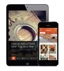
Consumer – Snapguide helps to create how-to guides for the workplace. “Snapguide is an…App for individuals to find, create, and share how-to guides via the iPhone. Guides can include text, photos and video and allow users to make comments, ask questions, and share. While Snapguide is a consumer-focused solution and guides are public, a similar type of application could have a high degree of usefulness in an enterprise setting.” xx
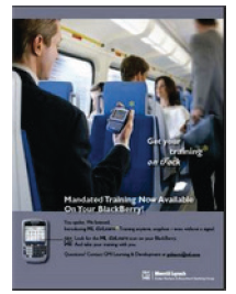
Enterprise – Merrill Lynch launched a mobile education initiative called GoLearn, which offered three mandated courses via BlackBerry. Over a seven-week period the learning materials were sent to over 2,100 investment bankers and support staff. “Bankers who completed the training on average did so in 54 less minutes and tested higher on the final assessments than the remainder of the firm. Mobile users also completed their training twenty days earlier than those who trained via MLU (Merrill Lynch University). Overall the mobile learners obtained a 12% higher completion rate in 30% less time than the control group. 170 employees responded to a survey indicating: 99% felt the format and presentation supported the learning; 100% would complete more training in this format; and more than 75% praised the benefits of convenience, time management and training with no distractions.” xxi
“Apps” vs. Mobile Web
When it comes to mLearning, like any educational or training project, determining the process of development most suited to the learner’s needs depends upon a number of factors. This includes: target audiences, available budget, intended purposes and required features.
If your mobile goals are primarily marketing-driven, or if your aim is to deliver content and establish a broad mobile presence that can be easily shared between users and found on search engines, then the a mobile website is the logical choice. On the other hand, if your goal is to provide an application that needs to work more like a computer program than a website, then an App is probably going to be required. Generally speaking, a mobile website should be considered your first step in developing a mobile web presence, whereas an App is useful for developing an application for a very specific purpose that cannot be effectively accomplished via a web browser.xxii For example, it is not yet possible to fully and reliably integrate a mobile website with native hardware features of a given mobile device. In order to tap into the camera or the GPS module, your product would best be delivered as an App.
Mobile Websites (and Traditional Courseware)
There are a number of developmental and delivery advantages to using a web browser to launch mobile education. Accessibility and flexibility are huge factors that are widely appealing and can save time and money. A mobile website is instantly accessible to users via a browser across a range of mobile devices (iPhone, Android, Windows, etc.). Apps, however, can require a separate version to be developed for each type of device. Largely because of the specificity of App development that is so dependent on the type of mobile device, mobile websites are much more dynamic in terms of pure flexibility to update content. Updating is immediately visible rather than being pushed to users, which then must be downloaded in order to update the App.
Mobile websites are also much easier for users to find because pages can be displayed in search results and listed in industry-specific directories, making it easy for qualified visitors to find them.xxiii It is also possible to allow regular visitors of a given website to be automatically sent to a mobile site when they are on a handheld (using device-detection). In contrast, the visibility of Apps is largely restricted to manufacturer App stores. Mobile website URLs are easily shared between users via a simple link (i.e. within an email, text message, Facebook or Twitter post). Publishers can easily direct users to a mobile website from a blog or website, or even in print. An App simply cannot be shared in this fashion.
As previously mentioned, mobile website development is considerably more time and cost-effective than development of a native App, especially if you need to have a presence on different platforms requiring development of multiple Apps. The cost of developing an App as compared to a mobile website does not end with the initial launch. The process of properly supporting and developing an App, including; upgrades, testing, compatibility issues and ongoing development, is more much more expensive and involved than supporting a website over time.xxiv
Apps
While the mobile web offers a number of inherent benefits, Apps can offer the best user experience throughout many specific use scenarios. For example, interactive gaming and manipulating data through complex calculations, charts or reporting is accomplished easier through the use of Apps. Apps are also convenient if the target audience will be using the App in a personalized fashion on a regular basis. While mobile web browsers are increasingly better at accessing certain mobile-specific functions such as click-to-call, SMS, and GPS, using the mobile’s camera or processing power for an mLearning module is most effectively utilized through an App.xxiv Apps also provide offline access to content and performance functions without a network or wireless connection, whereas web-based courseware does not.
One of the most important considerations when developing an App is to ensure that you are getting an optimal return on your investment. What you want to avoid at all costs is the needless and expensive exercise of building an App to do something basic that can be achieved with a mobile website.xxvi
Performance Tracking (SCORM VS. xAPI)
Despite the many educational advantages and innovations that mobile learning offers the user (including the unique benefits of both mobile apps and websites) there have been serious developmental hurdles to overcome. Performance tracking for eLearning has most recently been achieved through SCORM. SCORM is essentially a set of technical standards for e-learning software products. That is, it governs the line of communication between online learning content and Learning Management Systems. It allows content to be loaded into, launched from, and tracked by most any LMS using a common rule set. It is particularly this tracking ability SCORM provides that is so coveted by instructors in eLearning. It is often essential in the direction and execution of lesson plans and learning content delivery through completion reporting, timing, and testing.
For all intents and purposes SCORM is a highly effective component of eLearning, however, as we’ve seen what works for eLearning does not guarantee a successful translation to mLearning. SCORM, the once panacea of tracking initiatives, is not without its limitations; limitations that are indeed at odds with the broadening recognition and importance of mobile education.
So what issues does mobile learning present that did not previously exist in eLearning? The answer lies in the inherent uses and functionality of mobile devices coupled with the intended interaction between users and mLearning content. As was previously discussed, mobile devices and the subsequent design of mLearning material may be used in an entirely different manner than the standard eLearning workstation. Developers and designers must consider the likely possibility that mobile learners will be frequently going in and out of wireless connectivity, using mobile apps, connecting through social media tools like Twitter and Facebook, and even transitioning between platforms (i.e. computer to mobile). The scope of learning activities is ever-broadening and now more than ever increasingly accessible through mobile technology. Communication, tracking, and data exchange between an LMS and an mLearning module that adheres to any or all of these listed constraints breaks the SCORM model. Collecting and interpreting data through an expanding context of learning activities requires a more sophisticated tracking model spec.xxvii Many experts are turning to the Experience API (xAPI/Tin Can) as that tool.
While the end goal of SCORM and xAPI is essentially the same, to track Learner Activities, xAPI is much less restricted in accomplishing this objective. xAPI is defined as a restful webservice, meaning it is prepared for a “less connected” environment. In SCORM, generally the courses are web content (html, flash, or other, but viewed in a browser). In xAPI the courses can be anything from web content to mobile Apps or even desktop applications.xxviii Reporting in xAPI is also more open through the use of a Learning Record Store (LRS) rather than SCORM content that is tied to a Learning Management System.
An LRS is simply a repository for learning records that can be accessed by an LMS, reporting tools, or another LRS, and can be stored as individual learning records and/or entire transcripts.xxix An LRS can live inside an LMS and use the LMS’s reporting tools to make meaning of the LRS data. What really allows the LRS to be particularly useful in mLearning is the ability to live on its own with reporting tools. This is vital in retaining progress and tracking offline learning that is common in mobile education. xAPI enables four key freedoms that optimize efficiency in mobile learning:
- Statement freedom, structured in a way that allows almost any activity to be recorded;
- History freedom, facilitating LRS’s to share data with one another even allowing learners to store information in “personal data lockers”;
- Device freedom, in which any device can send xAPI statements (mobile phones, simulations, games); not requiring a constant network connection; and
- Workflow freedom, allowing learning activities to break away from the LMS and the ability to track events wherever the learner is and on whatever device they choose.xxx
Mobile Authoring Tools
Developing mobile-compliant eLearning, or mLearning (remember, they’re not necessarily the same thing), can be achieved a number of ways. Regardless of whether you do it yourself, find in-house developers, or contract out – the range of authoring tools is wide with at least one useful tool available regardless of the actual development experience. Searching for ‘eLearning tools’ in your preferred search engine will bring up exhaustive lists. For the purpose of this paper, we’ll just talk about some of the more common options.
Adobe Captivate
Captivate has quite a history and has been through several updates over its long life. The most significant update recently has been the ability to publish ‘to HTML5’ instead of just SWF (Flash). From the Adobe website: “Adobe Captivate 7 software helps you rapidly author a wide range of interactive eLearning and HTML5-based mLearning. Easily create product demos in HD, drag-and-drop modules, application simulations, and soft skills training materials.” Its primary strength still lies in creating ‘application training’ with solid screen-recording capabilities and automated callouts but its ‘Advanced Actions’ and exposed properties allow for some fairly powerful custom slide possibilities.
Captivate can be quirky but is a solid platform for eLearning or mLearning development. It needs more robust support for mobile browsers; currently it’s really only purposed for iOS (Safari). However, considering the state of mobile browsers individually, the support isn’t bad and it will surely improve. Captivate does have more ADA/508 capabilities included then most other tools and can publish to a standalone App for iOS devices.
Articulate Storyline
Unlike Captivate, Storyline has a relatively short history, being available in the market for just over a year at the time of this article. However, it has proven a very useful and user-friendly tool – winning over many former-Captivate users. From the Articulate website, “It’s so intuitive and easy to use that you can get started right away—there’s no training required. If you’ve used PowerPoint, you’ll feel right at home.” And indeed, many folks we’ve worked with, given an equal level of novice experience, most seem to favor the Storyline interface and approach.
Storyline, however, has its quirks and limitations too, also needing improvement in its support for mobile devices and browsers as, like with Captivate, it seems to only have been extensively tested with iOS/Safari. Storyline also does not yet offer any way to deeply customize the skins and playback bar features (no SDK), and it does not expose internal values as Captivate does (i.e. try to implement a simple page counter in a Storyline project).
On the other hand, Storyline has fantastic layering and trigger capabilities, far more simple to implement that Captivate’s Advanced Actions; and it can publish to both SWF/Desktop and HTML5/Mobile, as well as to a product-specific App.
Trivantis Lectora
Lectora is and even more mature than, if not as well-known as, the two other products we’ve mentioned, but surely comes in at least in the top five in most lists. It enjoyed a surge in popularity when Apple publically abandoned Flash. Unlike many other authoring tools, Lectora never published to the SWF format and has always utilized a native HTML/javascript-based approach to its published courseware. This gave Lectora a nice head-start when tools like Captivate had to suddenly scramble to provide HTML publishing.
In addition, fans of Lectora insist it offers more flexibility then the more popular tools, and the professional package even includes screen capture, audio capture, and PPT import tools – keeping it well in-line with its competitors.
However, as with any tool that offers more flexibility, there also comes a steeper learning curve. Lectora isn’t necessarily difficult to learn, there’s just a lot more to learn. Lectora had a few issues with its SCORM implementation at first, as well as a few other growing pains (i.e. reports of very slow responsiveness in the authoring tool) – but those issues seem to be largely addressed by now.
While it tends to be the more expensive option, the full suite includes Flypaper, Camtasia, and SnagIt; which is a quite a solid mix of tools for the price. And unlike the other two tools, while Lectora will publish to mobile-compatible formats, Android devices seem to be more supported.
Custom Solutions
Sometimes the features that off-the-shelf tools provide just aren’t enough. Unfortunately, often a project vision needs to be scaled back to keep within the capabilities of the authoring tool. Instead of dumbing-down the product, however, consider pure custom development.
In the past, that largely meant developing a custom eLearning course using Adobe Flash. Nowadays, however, it more likely means creating a custom piece using HTML and javascript. HTML5 isn’t so much a necessity, HTML4 (a spec that’s been finalized for years) often works just fine, though its ‘fun’ features aren’t as developed as HTML5, and multimedia will require a ‘web player’, which many mobile devices just won’t support. It really comes down to the requirements of the courseware you’re developing.
Back when SCORM was a younger specification and few tools supported, or properly supported, the spec, we here at ICS Learning Group developed our own custom eLearning ‘engine’ or ‘shell’ – including features such as an interface with branding options, built-in SCORM compliance, and an included quiz engine. Whenever we ran into a restriction in one of the commercial tools, we could turn to our custom shell and easily code around it.
With the rise of HTML5, we have done much the same – creating a custom HTML5 ‘shell’ which can load in a variety of content, from simple images to SWF files to other HTML/JS-based content. The shell will sequence and track the media, provide SCORM and xAPI (TinCan) tracking, and provide a simple method of building custom quiz questions.
Custom solutions can potentially be more expensive in the short term but, with proper planning and reusable resources and code bases, efficiencies can quickly be gained and superior products can result with little additional longer-term cost.
Optimizing Mobile Content (Images/Video/Audio/Text)
The variation of mobile device features and screen sizes, battery life, and bandwidth considerations all make giving additional thought and effort to delivering mLearning courseware. Content must be adapted to a wide range of devices with different capabilities and resolutions (display sizes).
Sites that use responsive web design allow your content to be delivered from the same set of URLs, with each URL using CSS to determine how the page is rendered on the target device. Using responsive design means no redirection to a mobile-specific site, which reduces loading time makes it easier for your users to interact with, share, and bookmark your content.
Content accessed via mobile networks will generally load slower than when accessed via traditional networks (i.e. desktop) simply due to the current limitations of mobile bandwidth and connectivity. Thus, it’s important to keep the content and layout as streamlined as possible. For best results:
- Make sure that your source material is the highest quality possible and don’t hesitate to scale down to a smaller, compressed file.
- Use graphics with smaller file sizes, using JPEG (photo), .GIF and .PNG (non-photo) formats, to save screen space and load time, but not so tiny the user has to zoom in to see them clearly. A good target is to use close-up and medium shots over long shots with lots of tiny detail.
- If your courseware can be made flexible with a responsive design, consider using a one-column layout for mobile delivery; i.e. collapse that table-of-contents into a button.
- Keep navigation simple and allow for larger buttons (‘fingertip-size’ = 44x44px) on smaller screens, and allow for good white space so learners click the button they intend to.
- While generally more a function of the LMS, ensure your courseware supports bookmarking, as ‘mobile’ certainly implies the learner likely won’t get through the whole piece in one session.
- Try scaling up your fonts a couple of points, via the responsive CSS, when on mobile and utilize bullet points and lists as strategies to keep the text clear and readable.
- Across the globe, connectivity varies greatly, providing all the more reason to optimize your courseware for the platform. Here are some speed estimates of various networks types:
- EDGE: Peak bit-rates of up to 1Mbit/s and typical bit-rates of 400kbit/s.
- 3G: Typical/average download speed is between 600 Kbit/s – 1.4 Mbit/s.
- 4G: Typical/average download speed is between 3 Mbit/s – 6 Mbit/s.
- HSPA+: Peak data rates up to 56 Mbit/s download (in theory); up to 28 Mbit/s currently) and up to 22 Mbit/s upload.
- WiFi: Peak data rates up to 300 Mbit/s bi-directionally.
(Source: Wikipedia.org: actual rates may vary by network provider.)
Expectations of quality and accessible information will continue to increase as mobile devices and overall access becomes more integrated into people’s lives. Designing and optimize content for a mobile experience – from efficient design for loading over a variable mobile network to responsive design for a variety of devices – is quickly becoming a required part of the eLearning development process overall, no longer restricted to just mLearning design considerations.
Moving Forward
The unique benefits and capabilities of mLearning and eLearning are often designed to work together, building off one another. This has the potential to further expand where and how the learning experience happens by allowing learners to participate in educational activities without the restrictions of time and place. Mobile technologies have the power to make learning even more widely available and accessible than we are used to in conventional eLearning environments. The role that communication and user interaction play in both the eLearning and mLearning process, as well as its critical success in contemporary educational models, is the key factor that marry these two concepts.
Imagine a user experience in which learners navigate through an eLearning module exploring the content structure, in-depth concepts and complexities of the course material. Now imagine that that learner is able to take their learning one step further through a corresponding mLearning module, driving the content home by offering contextual learning opportunities through interactive games using geolocation and short video recordings; building from the unique capabilities of a mobile device.
ELearning modules can act as the main vehicle for content while mLearning modules function as a tool for on-demand access to information, learning feedback, advice, support, and specific learning materials—all thriving off of mutual interaction. While eLearning and mLearning development does not have to be so intertwined, within this context the partnership between mLearning and eLearning can drastically improve upon both learning modules, heightening user engagement to new levels and further contributing to the quality and improvement of education as a whole.
EndNotes- http://www.learndash.com/making-mobile-learning-work-infographic/
- http://www.dashe.com/blog/mobile-learning/mobile-learning-more-than-just-mobile-learning/)
- http://www.dashe.com/blog/mobile-learning/mobile-learning-more-than-just-mobile-learning/)
- http://blog.learnlets.com/?p=3370
- http://blog.learnlets.com/?p=3370)
- http://www.irrodl.org/index.php/irrodl/article/viewArticle/346/875Gode
- http://www.irrodl.org/index.php/irrodl/article/viewArticle/346/875Gode
- http://www.dashe.com/blog/mobile-learning/mobile-learning-more-than-just-mobile-learning/)
- http://www.irrodl.org/index.php/irrodl/article/viewArticle/346/875Gode
- http://community.articulate.com/forums/p/12521/76078.aspx
- http://www.training-partners.com/downloads/elearning/TT_Whitepaper_Developing_Content_for_Mobile_Learningv2_0.pdf
- http://www.training-partners.com/downloads/elearning/TT_Whitepaper_Developing_Content_for_Mobile_Learningv2_0.pdf
- http://www.training-partners.com/downloads/elearning/TT_Whitepaper_Developing_Content_for_Mobile_Learningv2_0.pdf
- http://rjacquez.com/learning-designers-have-3-choices-regarding-mobile-learning-mlearning/
- http://blog.icslearninggroup.com/2012/04/elearning-vs-mlearning.html
- http://www.kineo.com/mobile-learning/mobile-learning.html
- mLearning: Using Mobile Devices in Learning, Joanne Woodrow, Center for Learning Innovation
- mLearning: Using Mobile Devices in Learning, Joanne Woodrow, Center for Learning Innovation
- mLearning: Using Mobile Devices in Learning, Joanne Woodrow, Center for Learning Innovation
- http://www.bottomlineperformance.com/mlearning-thoughts-3-mobile-learning-examples-you-might-have-missed/
- https://sites.google.com/a/adlnet.gov/mobile-learning-guide/examples
- http://www.hswsolutions.com/services/mobile-web-development/mobile-website-vs-apps/
- http://www.hswsolutions.com/services/mobile-web-development/mobile-website-vs-apps/
- http://www.hswsolutions.com/services/mobile-web-development/mobile-website-vs-apps/
- http://www.hswsolutions.com/services/mobile-web-development/mobile-website-vs-apps/
- http://www.hswsolutions.com/services/mobile-web-development/mobile-website-vs-apps/
- http://www.impactinstruction.com/learning/the-tin-can-api-and-scorm/
- http://stackoverflow.com/questions/11880116/what-is-difference-between-tincan-and-scorm
- http://tincanapi.com/learning-record-store/
- http://tincanapi.com/overview/
- http://matheasy.webstarts.com/uploads/The_role_of_m-learning_in_the_future_of_e-learning_in_Africa.pdf https://developers.google.com/speed/ http://www.adobe.com/devnet/devices/articles/video-player-optimization.html